OK, so I decided to finally create this website and blog and all, and the initial impetus for it was that there’s no good single place for Atelier Sophie FAQs or walkthroughs, it’s all spread across the universe, thinly sprinkled in blogs and chat threads. I beat the game and really liked it; it was even the first game I actually every platinumed, and I figured that, when I got into the clubhouse, I should extend a ladder to help other people up. Thus was born the website, which will house my first ever game FAQ, but also all the other random crap that spills forth from my brain.
Enter the Atelier Sophie world map.
Nearly every game has one. Nearly every guide or FAQ has a big map on it, filled with all the cool late-game stuff you’ll eventually find in the unexplored, cobweb-encrusted corners of the plot.
Not Sophie. Oh, no. There’s nary a single world map.
Why? Because it’s a royal pain in the ass to put together, that’s why. The map in the game is completely dynamic, set at a steep perspective angle, and there’s no zoom-out feature. What to do about this seemingly intractable problem?
Destroy it.
I won’t just put together an awesome set of data, FAQ, and walkthrough for my fellow gamers. No. I will obliterate this difficult map. I will not only make it, but it’s going to a be a thing of god damn beauty.
I did not know what I was in for.
But first things first. The actual map data needed to be collected. Can’t do much without data, and I wasn’t planning on sketching the thing by hand.
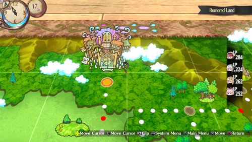
Note a few things:
- The “grid” is a trapezoid.
- The library there is not in perspective, it’s flat.
- The gray menu bar on the bottom.
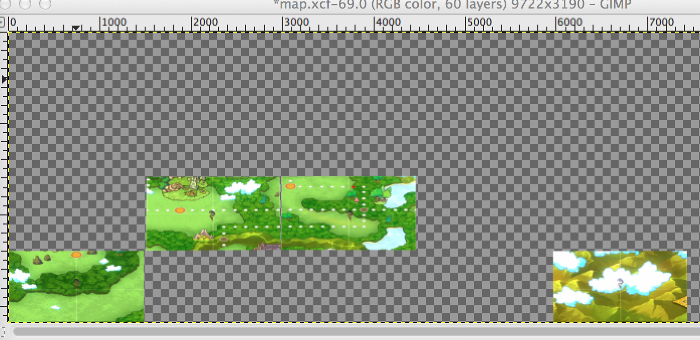
After grabbing all 28 of those pictures, time to make a flat map. Enter the hero of our story here, GIMP. If you don’t have photoshop, download this tool, it’s incredibly powerful.
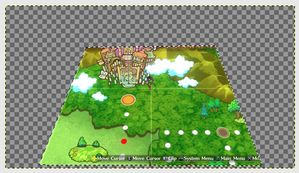
First I cut out all the trapezoids, and then stretched them into rectangles.
 |
 |
 |
And tiled them to make the map.
However, most of them had that annoying gray menu at the bottom. So, to cover the sins of the stitching together process and also that nasty menu bar that would have repeated on every grid square, I put up a black border.
 |
 |
But the black was just ugly. So I used some tools to smear the colors closest to the black bars onto the black bars. It didn’t perfectly “sew together” the pieces, but it’s as good as I’m going to get without somehow getting a raw image dump from the game internals or something.


That’s better, but still ugly. The dots next to the cities are all wonky, the white dot “paths” are different colors (because the game makes them red when there’s an event and stuff – I couldn’t clear everything out prior to taking snapshots). So I made a layer with new dots on it, and then did the same thing for the paths between the dots.
 |
 |
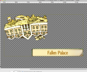
Next thing to fix. The poor cities have all crumbled to dust under the weight of the metaphysical trapezoid stretch process. Remember how I mentioned that the ground is on a perspective but the cities aren’t? Well, the trapezoid stretch “un-perspectived” the cities and made them look like a nuclear play-dough meltdown happened. No way to undo it – need to overwrite it with normal versions. So, while I was at it, I took screenshots of all the labels, too. Also, in retrospect, choosing to display the Fallen Palace here, as an upstanding examplar of “proper perspective” is kinda funny, being that it’s upside down. 🙂
 |
Pasting that onto the map really makes a difference, doesn’t it? 🙂 Or rather, making a new layer for it – not pasting. That’s important.
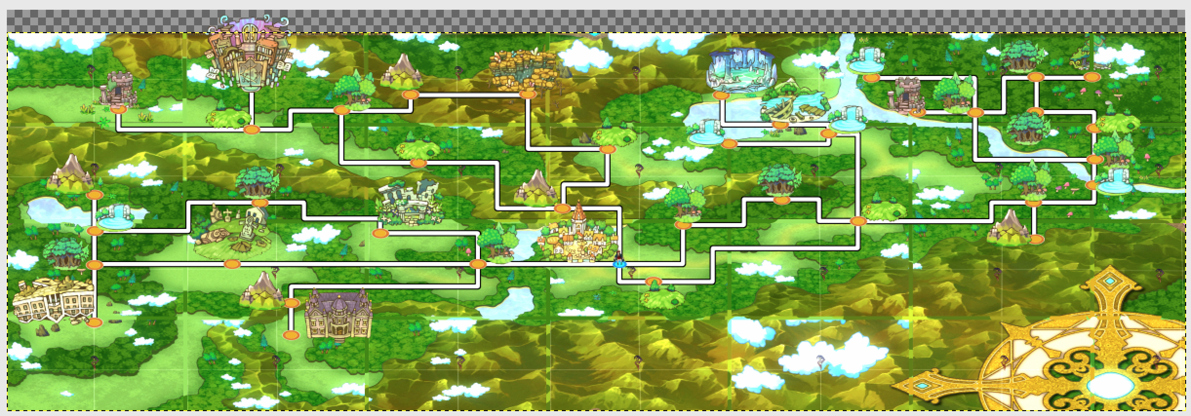
But for now, without the labels, here’s the current state of the “non-dynamic” map:
Enter now, if you dare, the hell of dynamic map interaction…